Intro to Styles
Styles are reusable design rules that help keep your work consistent and easy to update. By using styles effectively, you ensure that your projects remain visually cohesive, easy to manage, and beautiful.
Before we dive in, it's important to note that there are several types of styles you can create in Framer—color styles, text styles, and link styles. Each type serves a specific purpose to help keep your design consistent and efficient.
Color Styles
Color styles let you define a color once and apply it everywhere. Instead of manually adjusting color after color, you set a style and reuse it, so you know all the green buttons actually match.
You can create color styles in a couple of ways. While we can use the Assets panel to do this, the more common approach is right from the color picker in the Properties panel under Styles → Fill.
Select an element, go to Fill to open the color picker.
Choose your color, tweak the opacity, give it a name—Framer supports HEX, RGB, and HSL formats.
Click the + icon and give your style a descriptive name. (For instance, “Surface Night” for #0D0D0D.)

Once you hit Create, your color style is saved. You’ll see it in the Fill pop-up under “Styles,” ready to be applied to any element.
Applying your new color style is straightforward:
Select an element, go to Fill, and pick the style you created.
If you decide to change that style’s color later, everything that uses it updates instantly
You can repeat this process as many times as needed, creating a palette of colors ready to use across your site.
You can also manage all your styles by opening the Assets tab on the left and scrolling down to Styles and then Color.
Right-click a style to rename, delete, or duplicate it. You can even drag to rearrange your styles in any order.
Styles are reusable design rules that help keep your work consistent and easy to update. By using styles effectively, you ensure that your projects remain visually cohesive, easy to manage, and beautiful.
Before we dive in, it's important to note that there are several types of styles you can create in Framer—color styles, text styles, and link styles. Each type serves a specific purpose to help keep your design consistent and efficient.
Color Styles
Color styles let you define a color once and apply it everywhere. Instead of manually adjusting color after color, you set a style and reuse it, so you know all the green buttons actually match.
You can create color styles in a couple of ways. While we can use the Assets panel to do this, the more common approach is right from the color picker in the Properties panel under Styles → Fill.
Select an element, go to Fill to open the color picker.
Choose your color, tweak the opacity, give it a name—Framer supports HEX, RGB, and HSL formats.
Click the + icon and give your style a descriptive name. (For instance, “Surface Night” for #0D0D0D.)
Once you hit Create, your color style is saved. You’ll see it in the Fill pop-up under “Styles,” ready to be applied to any element.
Applying your new color style is straightforward:
Select an element, go to Fill, and pick the style you created.
If you decide to change that style’s color later, everything that uses it updates instantly
You can repeat this process as many times as needed, creating a palette of colors ready to use across your site.
You can also manage all your styles by opening the Assets tab on the left and scrolling down to Styles and then Color.
Right-click a style to rename, delete, or duplicate it. You can even drag to rearrange your styles in any order.
Text Styles
Text styles work the same way as color styles: they keep your typography consistent without endless manual adjustments. By default, any new text element is “unstyled,” so let’s fix that.
Let’s start by setting up a style for our Hero section.
Creating a Text Style
Select a text element in your design, then head to Text in the Properties panel to set your font, weight, size, etc.
Once you’re happy (say you’re creating a hero headline with a big, bold font like Switzer Semibold at 154px), switch over to the Styles property right below.
Click Create, give it a name (like “Hero Header” or something similar), and you’re set.
Looks great! Now, whenever you want a bold headline, just apply that text style instead of manually adjusting the font size each time. You can follow this same process for all your heading and body styles to keep your typography consistent.
You can have as many of these styles as you need for your project, for example if you need multiple body styles—say, one for a blog and another for a landing page—you can create separate paragraph styles to handle each scenario without any hassle.
Just like color styles, you can manage your text styles in the left panel under Assets → Styles → Text. From there, you can create, duplicate, rename, rearrange or delete styles as needed.
Let’s say you want just one word to pop in a different color, but you don’t want a whole new text style. No problem:
Highlight the specific word or phrase in your text element.
Go to the Properties panel, under Styles → Fill, and pick a different color.
This only changes that highlighted portion, leaving your main text style intact. Super flexible.
You might notice those Breakpoints tabs in the Text Properties panel. They help you adjust font sizes or other text properties for different device sizes—like mobile vs. desktop.
Worth Mentioning
Let’s briefly dive into the Framer CMS to see how we’re able to use text styles for your content.
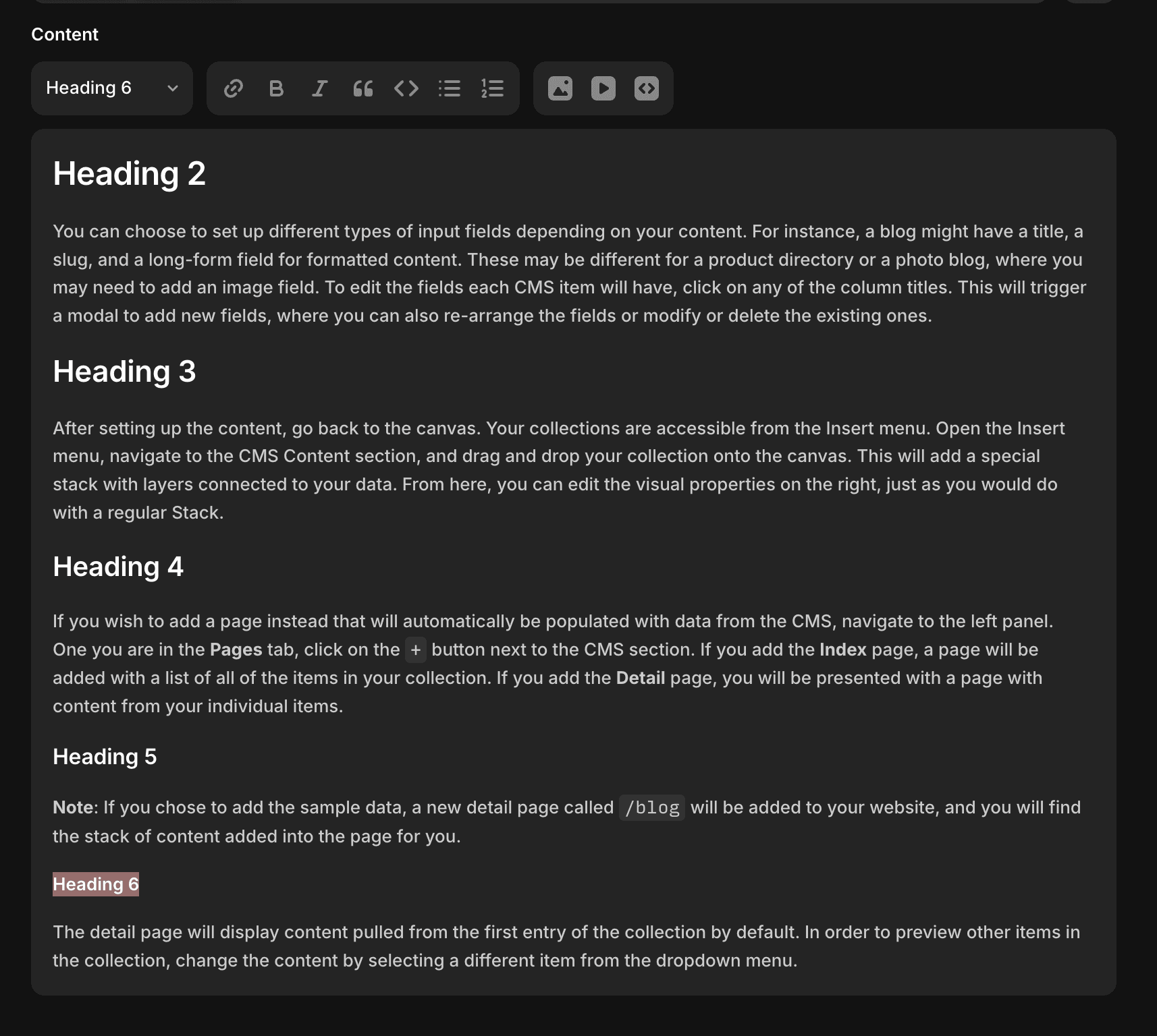
Framer’s CMS (content management system) is a flexible tool that helps you manage all kinds of content, from blog posts and job listings to marketing pages. It’s a convenient, streamlined way to organize and showcase everything you need on your website.
If it’s your first time adding a collection, Framer will automatically populate some sample blogs for you along with the accompanying styles. We can either update the styles it gives us or replace them with styles we’ve already created.
First, let’s navigate to a blog post. You can do this in the Pages panel by opening the collection folder and selecting the collection.
Next, select the content and in the properties panel under Text, you’ll see the premade styles for this collection. We can click into each one to open the individual style pop ups and make changes here as needed. These styles will reflect across all collection pages they’re applied to.
You’ll want to style your text directly in the CMS, Framer gives you a WYSIWYG editor. Type in your content, then use the dropdown to choose from your preset text sizes or styles or vice versa, select the size and then write your content. This keeps everything consistent across your entire collection.
Link Styles
Don’t forget, Framer also has Link styles! These operate similarly to color and text styles but focus on how your links look and behave. You can modify hover and active states, create multiple link styles for different needs—go as simple or as varied as you’d like.
And that’s a wrap! We covered:
Color Styles: Define once, apply everywhere, and keep colors consistent across your site.
Text Styles: Easily manage typography and keep headlines, body text, and accents looking harmonious.
CMS Integration: Apply your well-crafted styles to dynamic content like blogs or listings for a unified look.
Let’s briefly dive into the Framer CMS to see how we’re able to use text styles for your content.
Framer’s CMS (content management system) is a flexible tool that helps you manage all kinds of content, from blog posts and job listings to marketing pages. It’s a convenient, streamlined way to organize and showcase everything you need on your website.
If it’s your first time adding a collection, Framer will automatically populate some sample blogs for you along with the accompanying styles. We can either update the styles it gives us or replace them with styles we’ve already created.
First, let’s navigate to a blog post. You can do this in the Pages panel by opening the collection folder and selecting the collection.
Next, select the content and in the properties panel under Text, you’ll see the premade styles for this collection. We can click into each one to open the individual style pop ups and make changes here as needed. These styles will reflect across all collection pages they’re applied to.
You’ll want to style your text directly in the CMS, Framer gives you a WYSIWYG editor. Type in your content, then use the dropdown to choose from your preset text sizes or styles or vice versa, select the size and then write your content. This keeps everything consistent across your entire collection.
Link Styles
Don’t forget, Framer also has Link styles! These operate similarly to color and text styles but focus on how your links look and behave. You can modify hover and active states, create multiple link styles for different needs—go as simple or as varied as you’d like.
And that’s a wrap! We covered:
Color Styles: Define once, apply everywhere, and keep colors consistent across your site.
Text Styles: Easily manage typography and keep headlines, body text, and accents looking harmonious.
CMS Integration: Apply your well-crafted styles to dynamic content like blogs or listings for a unified look.
[CONCLUSION]
[CONCLUSION]
[CONCLUSION]
Remember, setting up styles in Framer might take a bit of upfront effort, but it saves you a ton of time down the road. One tweak to a style and your entire design updates like magic—no more endless manual fixes.
Remember, setting up styles in Framer might take a bit of upfront effort, but it saves you a ton of time down the road. One tweak to a style and your entire design updates like magic—no more endless manual fixes.

Jorge Zamora
Jorge Zamora
Jorge Zamora
[Head of Design]
[Head of Design]
[Head of Design]